 I don't know how many of you tuned into my little sojourn on the Today programme this morning on a new logo for the Conservative Party, but I did manage to mention a couple of your suggestions from the blog below. So, Serf, Remittance Man, you are now famous. The guy I was on with from Superbrand suggested the Party should adopt a dolphin as part of the logo, which appeals on a number of levels. It would certainly indicate the Conservatives were a Party with a porpoise (cue raucous laughter...).
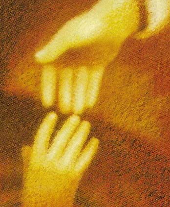
I think it was Albert Speer who once said that any logo for a political party must be something that any child can doodle, is simple and striking. I'm not sure a dolphin meets the first of those criteria. William Norton made a good point to me about it needing to be recognisable as a Conservative logo on the ballot paper. My own view is that it needs to encompass the human form in some way, and that linking hands may be the way to do it. Chris Palmer at Political Crossroads has made a stab at a couple of designs along those lines. I rather like this one (apart from the fact it is brown). It embraces the concept of modern compassionate Conservatism and is quite striking.
I very much hope that the Party is not going to spend thousands of pounds commissioning some advertising agency to create a new logo. It should instead launch a national competition and see what it comes up with. I'm sure those nice people at B3ta will be able to help....GULP.
32 comments:
While they're busy re-organising and re-branding, they could take this opportunity to recognise the largest nation in Britain. They have separate Welsh and Scottish Conservatives, so let's see if Cameron is capable of bringing the party up to date and launching an English Conservative Party. England should have recognition at national level, just as the neighbours have.
It is only fair to warn people that we wouldn't be the first party to use a dolphin, as the Sjukvårdspartiet Västra Götaland in Sweden uses it. A bit of sniffing around suggests it is a Swedish regional healthcare party.
Also, dolphins are a bit popular with new age loons and sloppy sentimentalists everywhere.
"I very much hope that the Party is not going to spend thousands of pounds commissioning some advertising agency to create a new logo. It should instead launch a national competition and see what it comes up with."
Yes, good idea. Why commission a professional to do it when you can leave it to a half-wit with a crayon?
Thanks for the mention. I will have to go under cover to keep away from the screaming fans.
Its all very well suggesting a cuddly new logo for the Tory party, right-on handshakes and cute dolphins and so on, but that doesnt sum up your party at all.
After all you are a patriotic, individualistic, business friendly party.
I think there's a real disconnect between what Tory bien pensants like to argue the party stands for: helping others to help themselves (yeah right), and the reasons why people actually vote Tory which usually include selfishness, greed, xenophobia etc.
The most honest political logo surely belongs to UKIP.
Take note that a party by the name of Liberal Democrats, uses the Dolphin Logo in Turkey.
Please, not handshakes - that would be so naff.
I agree with Tyke, creating an English Conservative Party is far more pressing than a new logo for the British Conservative Party.
"Why commission a professional to do it when you can leave it to a half-wit with a crayon?"
Well, quite; for it is undoubtedly cheaper to use amateur half-wits with crayons than professional half-wits with BAs in Graphic Potato-Printing.
Ok, so I've stolen this from the BBC comments section, but it really needed to be shared...
In line with new 'green' stance:
Keep the torch - but replace those nasty carbon-producing flames with an energy-saving bulb.
Iain,
Thanks for the credit, though given my usual mental state of an evening this might not have been so good for my reputation. Still even on the rational side of lunchtime I'm not sure about a dolphin.
Oh and so I can start composing my damage limitation letters to the rest of the clan, which of my suggestions did you actually mention on air?
Serf,
I dunno about you, but I guess any chance I ever had of a career in advertsing's just gone out of the window.
Anon 12:35
And exactly how do you think the professionals do it?
You don't actually believe that for all those thousands of pounds they paid real artists and graphics designers do you?
Oh, praise the Lord for the naievete' of the general public. It'll keep us in consultanting fees for generations.
RM
The hands logo does rather suggest that the common people are merely people while the government/rich/great & good are God.
Oh dear..... grammar schools and small-but-excellent government (to name but two sound, not unpopular policies) can be ditched without consultation with the party, but the corporate logo becomes a free-for-all.
A fairly good rule of thumb is not to trust the public on matters of taste. Otherwise you become the Davina McCall party, which can't really be for the betterment of Britain.
My own choice would be an English Oak in all its glory, reaching into an azure sky. It's a green thing in a blue world, it suggests permanence and reliability, and it trumps the rose which did so well in the days before the Great Noo Labour Unravelling.
Never mind that. What have you done with the banner on the blog? I know this is not a democracy, but I don't like it. The old one was much better. It looks cheap and ugly. Sorry but had to be said.
Iain - I like yournew logo, but not too sure about the "red top" and I see you've also abandoned the flag of St. George - perhaps you should re-introduce this, at least for the duration of England's participation in the World Cup.
I think what ever is done to change the logo there will be a certain amount of ridicule for a while, but it will get us some publicity none the less.
By the way Iain I like the site make over, very nice indeed.
Dolphin. Well that’s interesting. I have put up a few dolphin designs on my site (westbromblog.blog.com), but I don’t see how they represent the party even though they look good.
I agree with tyke, an English Conservative party, (like the Welsh and Scots) would be a good idea - we would need our own parliament first though. I liked it so much I came up with a logo for them too! lol
God, I have to much free time today.
This re-branding thing is obviously catching.
Nice new banner, Mr Dale. I teated myself to one over the weekend.
Such symbols and logos should encapsulate something of one's essence... this one seems to be pink or red...why?
Og's oak sounds pretty good. Solid and English yet pushing the right greenie buttons. I guess I could live with that.
By the way, Iain, Shed Man says the idea of a flaming sword skewering the severed head of a socialist didn't go down too well with the apparatchiks at the Beeb. Sorry if it got you into trouble.
RM
Hmm! Two hands - one above the other! Looks like maybe the "Upper Hand" (sorry about that!) has just let go of the "Under Hand". Maybe it's David letting go of some poor bugger from thze "A" List
Serf - that is a pretty tasty platform the Turkish LDs have, isn't it?
Og - I'd been thinking oak tree too.
Good idea to have a new logo, it suggests a new beginning and a departure from the past.
My suggestion for the Tory party is to keep the torch but to have John Prescott pissing into extinguished flames. So very true and accurate over the last ten years.
The two hands looks like Thatcher's hand (I have a sharp eye in these matters)
She is taking the bottle of milk (milk snatcher) from the innocent hand of the child.
I like this game.
Gary
Not sure about the brown hand things. "even the tories think Britain's best in Brown's hands" and so on...
Also it does sort of look like someone colour blind has tried to copy the roof of the sistine chapel the bit where God creates Adam. Not sure if that's really the message you want to be sending out
I think this pic of the hands looks too spooky, like aliens, I prefer the Political Crossroads version.
And I agree about a competition for the best logo. What would the prize me, I wonder.
They can copy my version for free (hint, hint!)
My problem with the linked hands is that that it's rather rememiscent of this - although adopting such a logo might pre-empt Labour's new rebranding rather nicely...
The Oak does seem like quite a nice idea though.
You think hands would be a good idea? May i suggest this logo then:
http://www.flickr.com/photos/98352291@N00/sets/72157594164815224/
Well if it's a dolphin, the old phrase 'flogging the dolphin' will acquire a whole new meaning.
Iain,
A few things here.
The new header looks a lot better. The quotes are great, really help position you as the Tory blog of choice. Good work. I actually think the photo is OK, looks more real than some of your publicity shots.
I'm often invited on to the Today programme to discuss branding, so I listened with professional interest today.
I don't think the Tories should change their logo at all. The reasons seem obvious.
1. It's always better to rebrand AFTER you've changed, not before or during. I'm sure the guy from Consignia will back this up.
2. Any change will give your opponents a change to deride you. There is no logo that would receive positive criticism from the Press. What would you change too? Hands? (What hands? Man? Woman? Black? White?) An animal? (Dolphin? Tories sink under new logo, Cameron the Flipper Flopper?). See what I mean?
3. Why not stick with what you've got? I always feel this about the Tories in general to be honest. Lower taxes, family values, entrepreneurism? I don't think you'd have problems selling that. Would you?
Not a pair of linked hands, didn't the old East German SED have a linked hand logo? We are not moving that far to the left!
The Anonymous Graphic Designer says all that needs to be said. Anyone looking for a change of identity is the SAD old bugger my daughters tell me not to be. Most identity changes are ridiculous (Nicky Haslam, anyone?) and unnecessary.
I'm glad the Oak gained a vote or two. At the cricket lunch at Arundel today it won a straw poll by 7 to 2.
I know I've thrown more than my twopennyworth of ideas around on this but to be honest I'm not so sure about all this rebranding. Or at least I have reservations regarding the diversion into discussion about what picture to put on the party letterhead.
Call me a cynic if you will, but my experience in industry is that rebranding by changing a logo is symptomatic of clueless executives grasping at straws.
What makes companies succeed are clear goals and a simple strategy properly explained to employees and customers. Spending time having to explain the existential meaning of the pretty picture on your letterhead wastes detracts from that message.
Unfortunately the serious introspection needed to set goals and define a strategy requires hard work, honesty and the taking of risks. Drawing pictures doesn't, hence the enthusiasm executives display for logo changes.
While a new letter head for the Conservative party might be nice and throwing ideas around has been fun; wouldn't all this creative tory energy be better spent working out what policies and directions the party is going to take to win the next election (and the next three after that)?
RM
The use of linked hands, in any way, would be a monumental mistake. To impliment such a cliche would show the party to be visually un-aware and anything but forward looking.
Post a Comment